VP Swiper Slider - Responsive Breakpoints
Responsive breakpoints let you change how many slides are visible and how much space is between them at different screen sizes. Without breakpoints, a slider that looks great with 4 slides on a desktop turns into a cramped mess on a phone. This article covers how breakpoints work in VP Swiper Slider, where to configure them, and what values actually work in practice.
How breakpoints work
VP Swiper Slider uses a mobile-first breakpoint model. Each breakpoint defines a screen width and the slider settings to apply from that width upwards. Anything narrower uses the base settings configured on the Module tab.
For example, if you set base Slides per view to 1 on the Module tab, then add a breakpoint at 768 with Slides per view 3, the slider will show 1 slide on mobile (below 768px) and 3 slides on tablets and desktops (768px and above).
You can stack as many breakpoints as you need. The browser picks the largest one that matches the current viewport width.
Configuring breakpoints
Open the module editor and switch to the Slider breakpoints tab. You'll see a subform with a + button to add breakpoint rows.
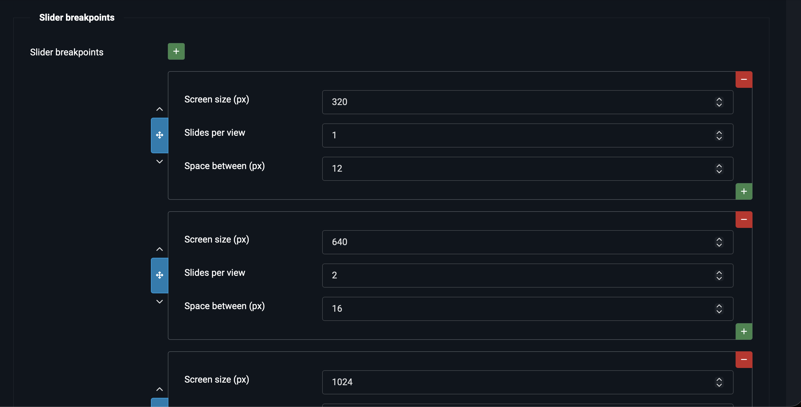
Each breakpoint row has three fields:
- Screen size (px) — the minimum viewport width in pixels at which this breakpoint kicks in. Common values: 576 (small tablet), 768 (tablet), 992 (laptop), 1200 (desktop), 1400 (wide desktop).
- Slides per view — how many slides to show at this width.
- Space between (px) — pixel gap between slides at this width.
That's the entire configuration. Two values per breakpoint — slides per view and spacing — because those are the two settings that actually change between screen sizes for most sliders. Other slider behaviour (autoplay, loop, effect) stays the same across all widths.
Recommended values per source
The "right" breakpoint values depend on the content source. Some practical starting points:
| Source | Base (mobile) | 768px (tablet) | 1200px (desktop) |
|---|---|---|---|
| Image slider (hero banner) | 1 slide, 0px | 1 slide, 0px | 1 slide, 0px |
| Images (gallery) | 1 slide, 10px | 2 slides, 20px | 4 slides, 30px |
| Articles (cards) | 1 slide, 16px | 2 slides, 24px | 3 slides, 32px |
| Vendors (logo strip) | 2 slides, 20px | 4 slides, 40px | 6 slides, 60px |
| Custom code | 1 slide, 10px | Depends on content | Depends on content |
Hero banners (Image slider) don't need breakpoints — they're always one full-width slide. Galleries and card sliders benefit most because the visual difference between "one card on mobile" and "four cards on desktop" is dramatic. Vendor logo strips need especially aggressive breakpoints because logos look tiny on a wide screen if you only show two.
Common breakpoint widths
You don't have to use these exact numbers, but if you want to match what most CSS frameworks use, here are the conventions:
| Width (px) | Device class | When to use as a breakpoint |
|---|---|---|
576 |
Small phones & up | If mobile needs a slightly different layout from very small phones |
768 |
Tablets & up | The most important breakpoint — phones below, tablets and desktops above |
992 |
Small laptops & up | When the tablet layout looks too crowded on a laptop |
1200 |
Desktops & up | When the laptop layout has spare room for more slides |
1400 |
Wide desktops | Only needed for very wide monitors or very dense content |
In practice, most sliders need only two breakpoints: 768 (tablet bump) and 1200 (desktop bump). Adding more rarely improves the user experience and starts to make the configuration hard to reason about.
A complete example
Here's a real-world configuration for a four-card Articles slider that looks good from a 360px phone to a 1920px desktop:
Module tab — base settings:
- Slides per view:
1 - Space between slides:
16
Slider breakpoints tab — three rows:
| Screen size | Slides per view | Space between |
|---|---|---|
576 |
2 |
20 |
992 |
3 |
24 |
1400 |
4 |
30 |
Result: 1 card on phones (under 576px), 2 cards on landscape phones and small tablets, 3 cards on laptops and standard desktops, 4 cards on wide desktops. Spacing grows gently with the screen, so cards never feel cramped or too spread out.
Testing your breakpoints
The easiest way to verify your breakpoints work is to use the browser's responsive design mode. Open the page with your slider, press F12 (Chrome / Firefox / Edge), click the device toolbar icon (or Ctrl+Shift+M), then drag the viewport edge to resize. You'll see the slider re-arrange itself in real time as you cross each breakpoint width.
Effect-specific considerations
Some transition effects don't support multiple slides per view. If you're using one of these, breakpoints can still adjust spacing but Slides per view should stay at 1 across all widths:
- Fade, Cube, Flip, Cards, Creative — one slide visible at all times. Set Slides per view to
1in both base and every breakpoint. - Slide — works with any number of slides per view. Most common choice for responsive layouts.
- Coverflow — works with multiple slides per view (in fact, it needs at least 3 to look right). Good candidate for breakpoint tuning: 1 on mobile, 3 on tablet, 5 on desktop.
See Transition Effects for the full picture.
Next steps
- Advanced Pro Features — Zoom, Thumbnails, Grid, Parallax and other Pro options.
- Configuration Reference — every option in the module, explained in one place.
- Troubleshooting & FAQ — common issues and how to fix them.