VP Swiper Slider - Articles & Vendors Sources
This article covers the two content sources that ship only with the Pro edition: Articles, which pulls slides automatically from Joomla content categories, and Vendors, a purpose-built source for partner logo strips. Together they cover the two cases where Free sources fall short — content that updates itself, and the marquee-style logo band that's become standard on landing pages.
ArticlesPRO
Articles is the source you reach for when slides should come from content that already exists in Joomla — your blog, news section, case studies, anything organised into a category. Instead of duplicating articles into a subform, you point the module at a category and it pulls articles automatically. Publish a new post, it shows up in the slider on next page load.
How to configure it
On the Slide source tab, pick Articles (Pro) from the Content source dropdown. A small panel of options appears below.
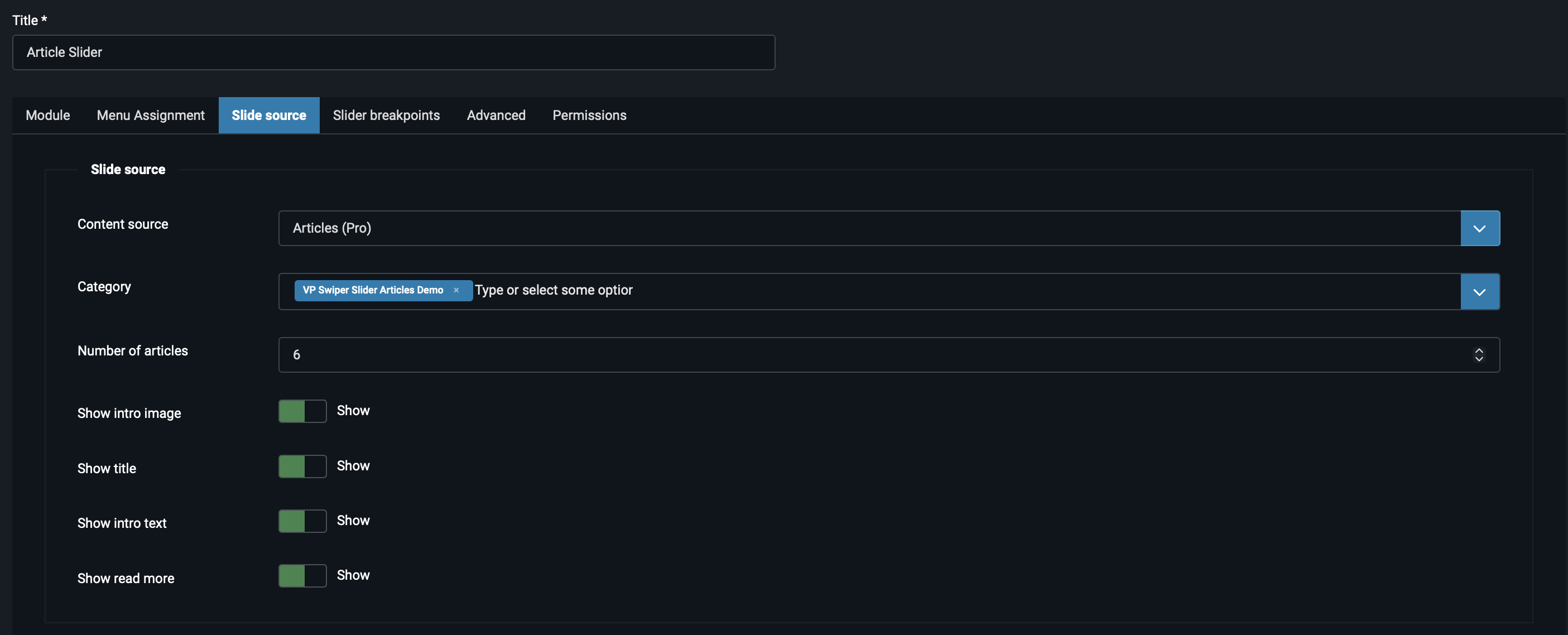
The available fields are:
- Category — a fancy-select dropdown listing every
com_contentcategory on the site. You can pick one or several; if multiple are selected, articles from all of them are pooled together. - Number of articles — how many articles to pull from the category (default 3). The module fetches this many articles regardless of how big the category is.
- Sorting — Ascending or Descending by publish date. Use Descending for "Latest news" sliders, Ascending for chronological order (e.g. step-by-step series).
- Show intro image — toggle the article's intro image on or off in the card.
- Show title — toggle the article title.
- Show intro text — toggle the article intro text. The module line-clamps long intros so cards stay equal height.
- Show read more — toggle the "Read more" link at the bottom of each card.
That's the entire configuration. There are no filters by tag, no advanced query options, no per-author selection — the source is intentionally simple. The decision is "which category, how many, what to show".
How cards are rendered
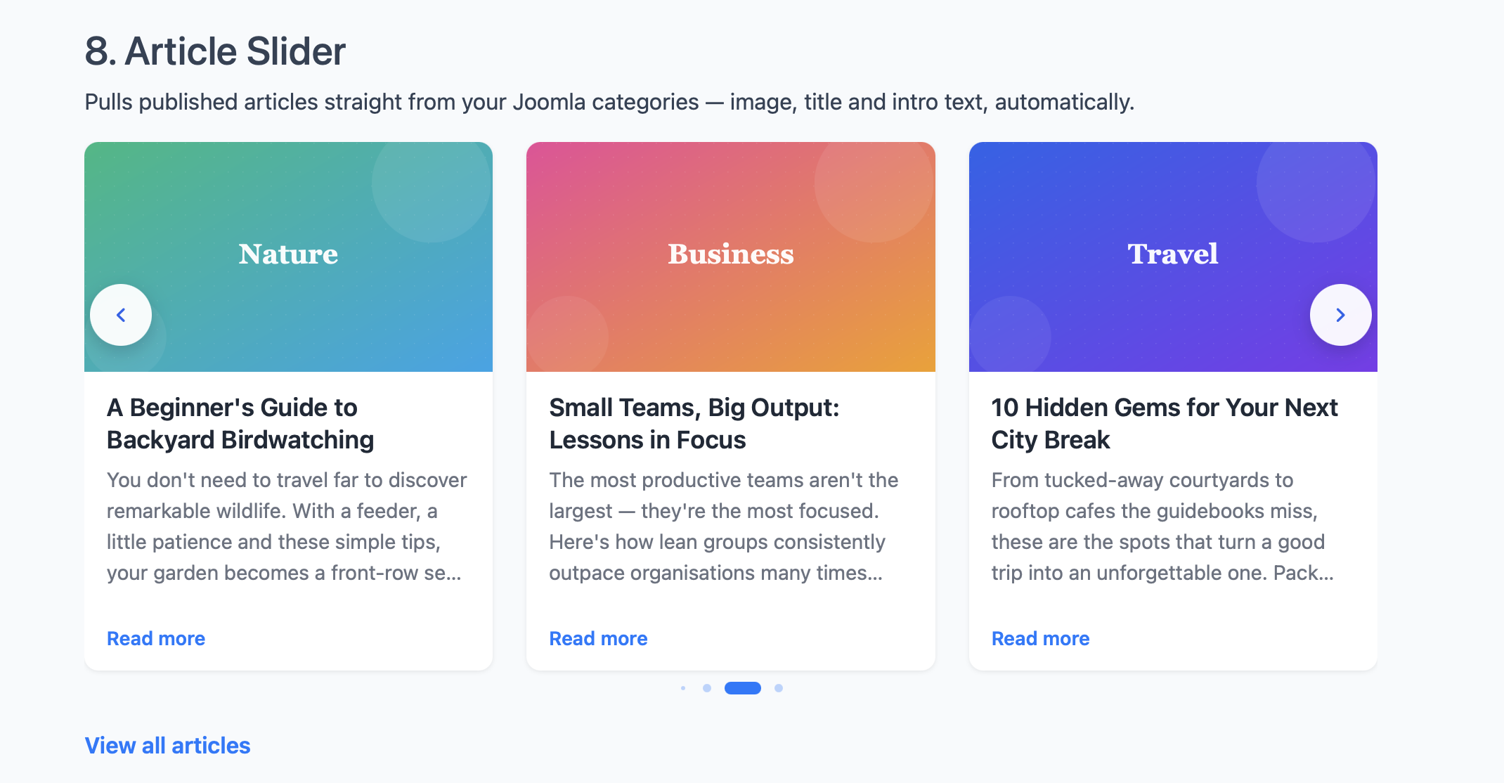
Each article becomes a card containing whichever elements you've enabled. The cards are equal-height — even if one article has a long intro and another has a short one, the cards line up at the same bottom edge. The intro text is line-clamped (truncated with an ellipsis) so long content doesn't blow up the row height.
Clicking the card title or the "Read more" link opens the full article. The intro image is also clickable.
Typical configurations
A few combinations that work well in practice:
| Use case | Configuration |
|---|---|
| Latest blog posts | Blog category, count 3-6, Sorting Descending, show all four elements (image, title, intro, read more). |
| Case studies grid | Case Studies category, count 6-9, Sorting Descending, hide read more (whole card is clickable through the title). |
| Image-only portfolio | Portfolio category, count 8-12, hide title and intro, keep only intro image visible. Combine with Pro Zoom for a photo gallery. |
| News ticker | News category, count 5, Sorting Descending, hide intro image and intro text, keep only titles. Combine with autoplay for a horizontal news scroller. |
VendorsPRO
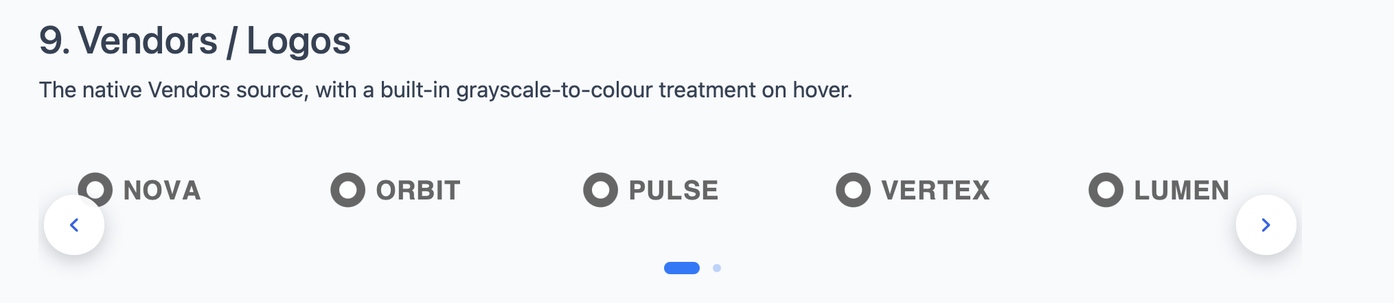
Vendors is the source for one specific job — showing a row of partner logos, sponsor marks or technology badges with a clean, professional look. It's the "as featured in", "trusted by", "powered by" strip that's become a fixture of modern landing pages.
How to configure it
On the Slide source tab, pick Vendors (Pro). A subform appears with a + button to add logos.
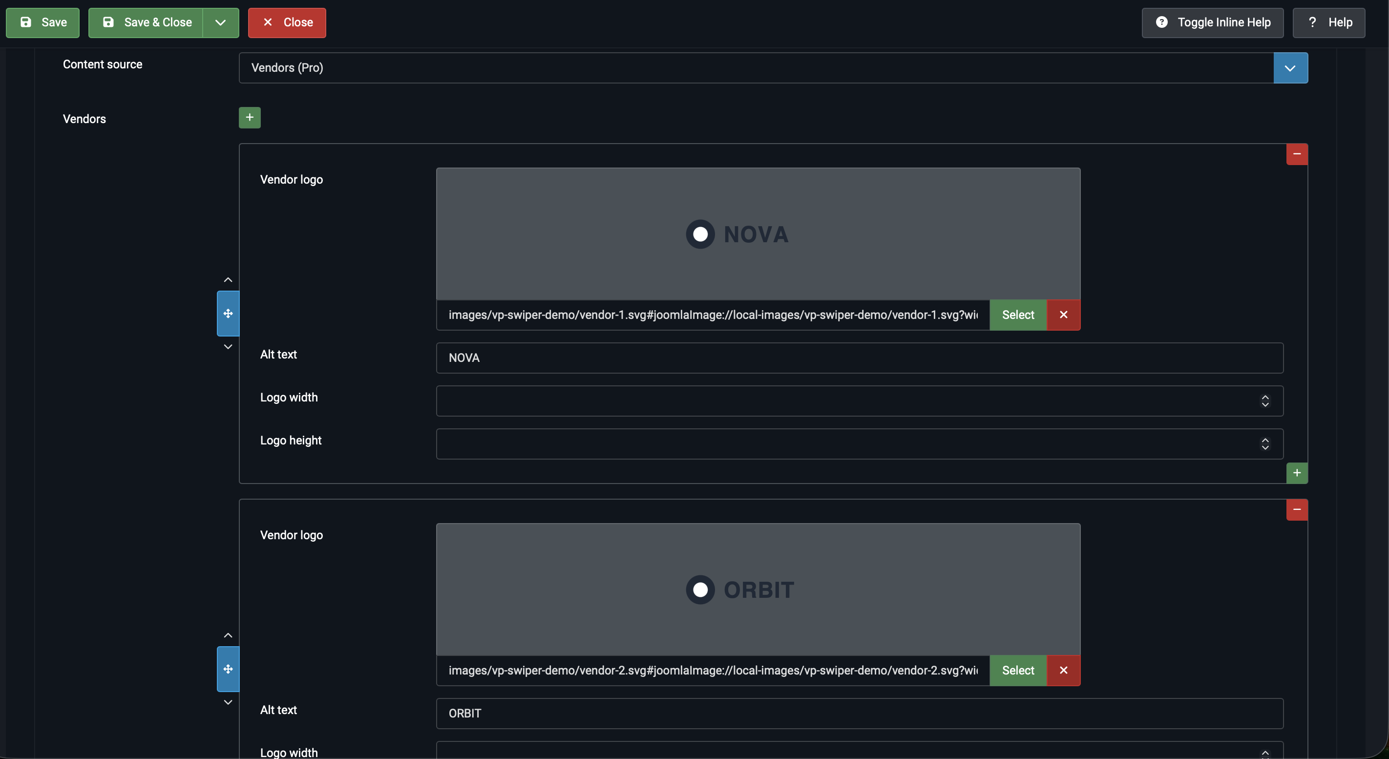
Each row has these fields:
- Image — the logo file. SVGs work best for crisp rendering at any size; PNG with transparent background is fine too.
- Alt text — accessibility text for screen readers and SEO. Usually just the company name.
- Image width — optional pixel width. Leave empty and the logo uses its natural size, capped by the slide.
- Image height — optional pixel height. Useful when logos in your set have wildly different aspect ratios — set a fixed height to align them visually.
The grayscale-on-hover effect
Logos render in grayscale by default, fading to full colour when the visitor hovers over a logo. This is a deliberate visual decision: it keeps the logo strip from competing with the rest of the page for attention while remaining interactive.
The effect is built into the source — there's no toggle for it in the admin. If you need a different treatment (full colour always, or different hover behaviour), it can be overridden through your template CSS.
Recommended Module-tab settings for Vendors
The Vendors source pairs well with these settings on the Module tab:
- Slides per view — 5 to 8, depending on how many logos you have and how wide they are.
- Space between slides — 30 to 60 pixels for visual breathing room.
- Autoplay — Yes, with a short delay (2000-3000 ms) for the classic scrolling marquee effect.
- Loop — Yes, so the strip never has an obvious "end".
- Navigation arrows — Hide. Marquee strips typically don't have navigation.
- Pagination — Hide. Same reason.
- Transition effect — Slide. Other effects don't suit a continuously scrolling band.
Articles vs Vendors — when to use which
The two sources solve completely different problems, so the choice is usually obvious:
- If the slide content already lives in Joomla as articles → Articles.
- If you're showing logos in a horizontal strip → Vendors.
- If you need something else (custom layouts, embedded videos) → look at Custom code from the Free sources.
Next steps
- Transition Effects — pair each source with the right transition (Slide for Vendors, Fade or Slide for Articles).
- Responsive Breakpoints — adjust slides-per-view per screen size, essential for both Articles and Vendors.
- Advanced Pro Features — Zoom, Thumbnails, Grid and the other Pro options on the Module tab.