VP Swiper Slider - Advanced Pro Features
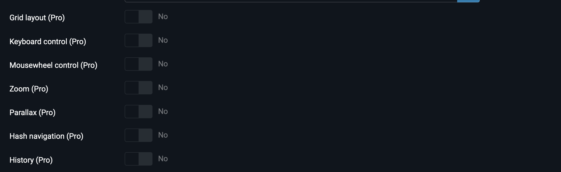
Beyond content sources and transition effects, the Pro edition adds eight optional features that can be layered on top of any slider. They're all switches or short configurations on the Module tab, mixed in with the regular settings and marked (Pro). This article walks through each of them — what it does, when to use it, and what it composes with.
Where to find the Pro options
All Pro features live on the Module tab, scrolled down past the standard slider settings. They look like the regular options — switchers and small numeric fields — but each is labelled (Pro) so you can tell them apart at a glance.
Zoom
Lets visitors zoom into a slide image by double-clicking (or double-tapping on touch devices) or by pinching. The slide image scales up while staying inside the slider boundaries, and the user can drag to pan around the zoomed view.
Best paired with: Images source (photo galleries) or Image slider source. Zoom expects each slide to be image-led — it doesn't add anything to text-heavy slides.
How to enable: Switch Zoom (Pro) to Yes on the Module tab. No other configuration needed — the zoom ratio, pan limits and touch behaviour all use sensible defaults.
Thumbnail navigation
Adds a small strip of thumbnails below the main slider for jumping directly to any slide. Clicking a thumbnail moves the main slider to that slide, and the active thumbnail is highlighted so the user always knows where they are. The standard e-commerce product gallery pattern.
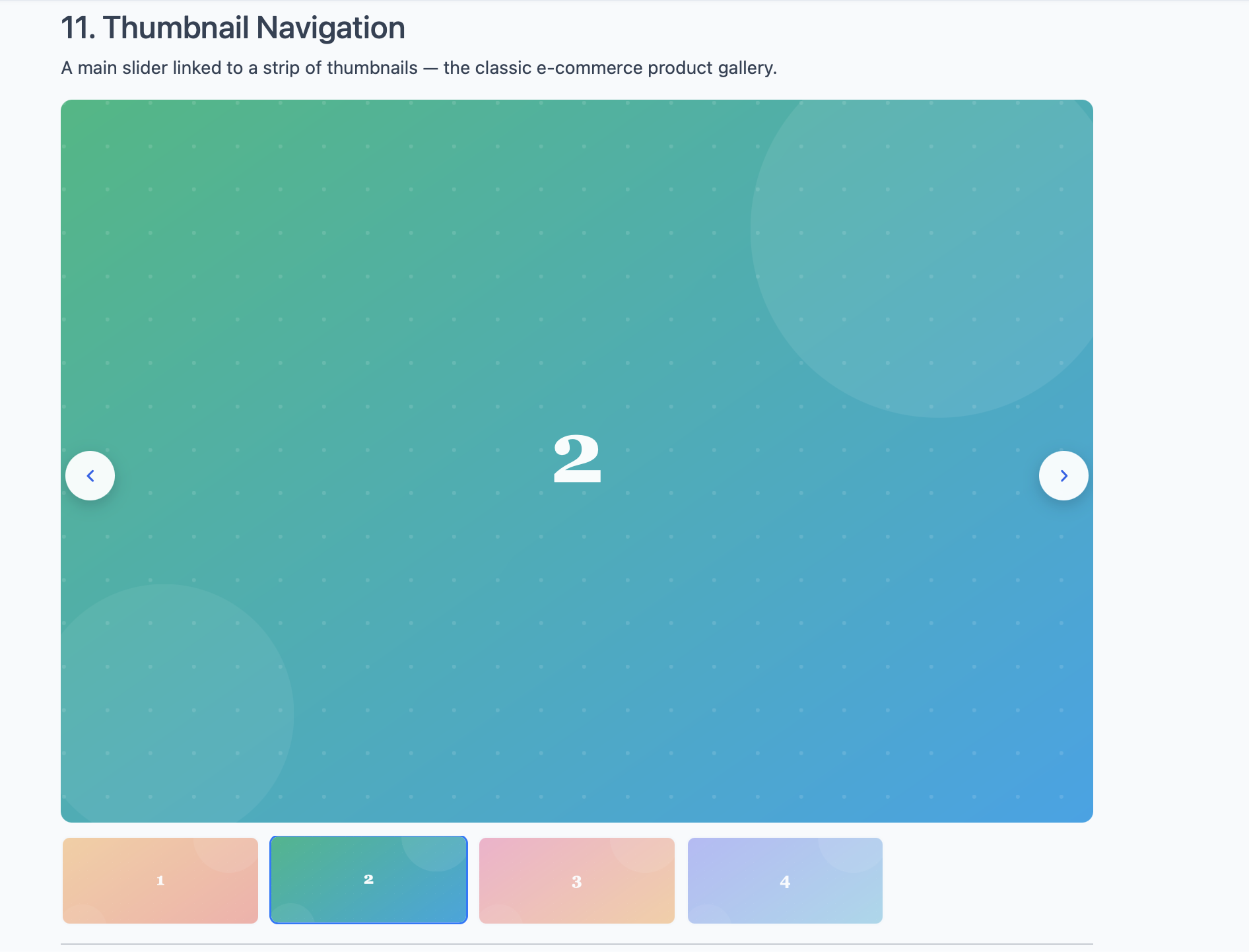
Best paired with: Images source for product galleries, Image slider for portfolio showcases.
How to enable: Switch Thumbnail navigation (Pro) to Yes. Three additional fields appear below it:
- Thumbnails per view — how many thumbnails to show in the strip at once (typically 4-6).
- Thumbnail height (px) — height of each thumbnail in pixels. 80-120 works well for most layouts.
- Slide on thumbnail click — whether clicking a thumbnail jumps the main slider to that slide. Set this to Yes unless you want thumbnails for visual decoration only.
The thumbnail strip is itself a small swiper — if you have more thumbnails than fit, the strip becomes scrollable.
Grid layout
Renders slides in multiple rows instead of a single horizontal line. The slider still advances horizontally, but each "page" of the slider contains a grid of slides rather than just one row.
Best paired with: Images, Articles, Vendors — any source where you have many slides and want to surface more than a single row at a time without sacrificing height.
How to enable: Switch Grid layout (Pro) to Yes. One additional field appears:
- Grid rows — number of rows in the grid (typically 2 or 3). With 3 rows and Slides per view set to 4, each page of the slider shows 12 slides.
Parallax
Adds depth to slide transitions by moving elements inside each slide at a different speed than the slide itself. Background images appear to drift slowly while foreground text moves at full speed, creating a subtle 3D feel.
Best paired with: Image slider source for hero banners. Parallax needs slides with structured content (image background + overlay text) to have something to parallax against. It doesn't do much for plain image carousels or logo strips.
How to enable: Switch Parallax (Pro) to Yes. No other configuration in the admin — the parallax depth uses Swiper's default values, which work for most hero-style content.
Keyboard control
Lets visitors navigate the slider using the left and right arrow keys on their keyboard (or up/down for vertical sliders). Useful for accessibility and for sliders that present sequential content the user is reading through.
Best paired with: Any source. Especially valuable for content-heavy sliders (Articles, Custom code) where users are reading rather than glancing.
How to enable: Switch Keyboard control (Pro) to Yes. The slider listens for arrow keys whenever it's visible in the viewport.
Mousewheel control
Advances the slider when the user scrolls the mouse wheel over it. Scrolling down moves to the next slide, scrolling up moves to the previous one.
Best paired with: Vertical sliders, or horizontal sliders that are the only thing on screen. Avoid combining mousewheel control with a slider that sits inline with other content — the user expects the page to scroll, not the slider.
How to enable: Switch Mousewheel control (Pro) to Yes.
Hash navigation
Reflects the active slide in the URL using a hash fragment. If your slides have data-hash attributes (set in Custom code source), changing slides updates the URL to example.com/page#slide-name. Visitors can copy the URL and the link will jump directly to that slide.
Best paired with: Custom code source, since that's where you control the markup and can add data-hash attributes to each swiper-slide.
How to enable: Switch Hash navigation (Pro) to Yes. Then add data-hash="your-name" to each slide in Custom code:
<div class="swiper-slide" data-hash="intro">...</div>
<div class="swiper-slide" data-hash="features">...</div>
<div class="swiper-slide" data-hash="pricing">...</div>
Now example.com/page#features opens the page with the "features" slide active.
History
Like Hash navigation, but uses the browser's history.pushState API instead of hash fragments. Each slide change creates a new entry in the browser history, so the back and forward buttons step through the slides.
Best paired with: Single-page apps or full-screen sliders that act like distinct pages. For typical inline sliders, History is overkill and confuses the back button.
How to enable: Switch History (Pro) to Yes. Slides need the same data-history attribute that Hash navigation uses.
Composing Pro features
Pro features are designed to layer cleanly. Common combinations:
| Use case | Combination |
|---|---|
| E-commerce product gallery | Images source + Zoom + Thumbnail navigation |
| Photo portfolio | Images source + Coverflow effect + Zoom + Keyboard control |
| Marketing hero with depth | Image slider source + Fade effect + Parallax |
| Documentation slider | Articles or Custom code + Keyboard control + Hash navigation |
| Dense content grid | Articles source + Grid layout (3 rows) + Slide effect |
Don't enable a Pro feature just because it's available. Every option you turn on is one more thing the user has to understand. Pick the ones that solve a specific problem on your page; leave the rest off.
Next steps
- Configuration Reference — every option in the module explained in one place, including all the Pro features above.
- Troubleshooting & FAQ — common issues and how to fix them, including a section on Pro features that don't seem to work.