VP Swiper Slider - Transition Effects
VP Swiper Slider ships with seven transition effects. Two are available in the Free edition; the other five are Pro. This article covers what each effect does, when to reach for it, and which content source it pairs with. Because transitions are inherently animated, the best way to understand them is to see them live — head to the demo page first.
Where to pick an effect
Open any VP Swiper Slider module and stay on the Module tab. Scroll down to the Transition effect dropdown — all seven options are listed there. The Free edition silently ignores Pro effects if you pick one without Pro installed, so it's safe to experiment.
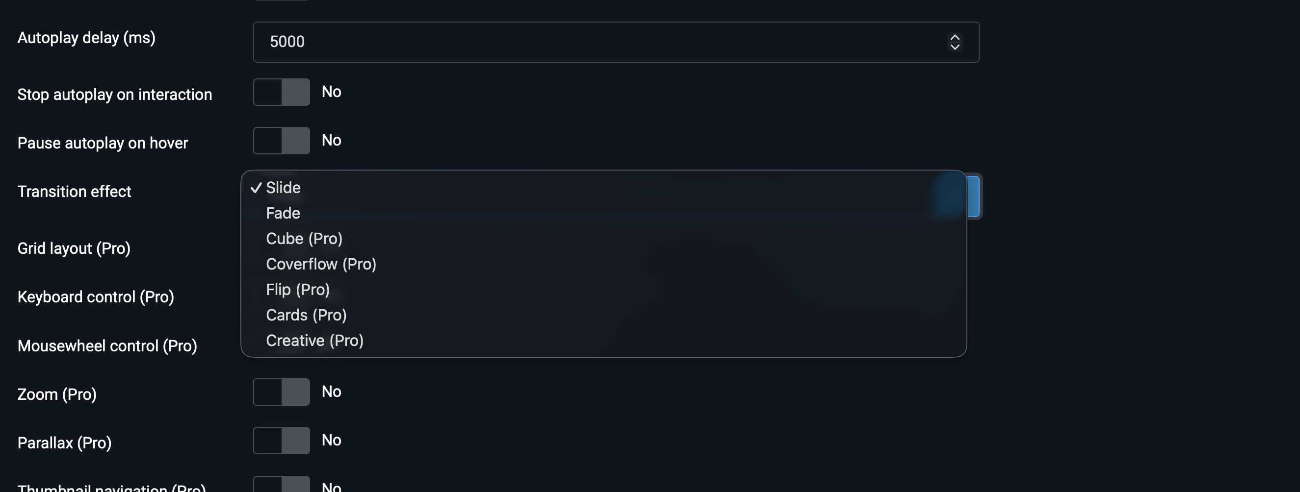
Quick reference
| Effect | What it does | Edition | Best for |
|---|---|---|---|
| Slide | Slides move laterally — the classic carousel | Free & Pro | Galleries, logo strips, article cards |
| Fade | Slides cross-fade in the same position | Free & Pro | Hero banners, single-image-at-a-time |
| CubePRO | Slides rotate around a 3D cube | Pro | Showcase pieces, attention-grabbing intros |
| CoverflowPRO | iTunes-style 3D carousel with depth | Pro | Photo galleries, portfolios, products |
| FlipPRO | Each slide flips like a card revealing the next | Pro | Before/after, FAQ-style reveals |
| CardsPRO | Stacked-card swipe like Tinder | Pro | Testimonials, profile carousels, picks |
| CreativePRO | Custom transform — depth + rotation + opacity | Pro | Designer-led, brand-specific motion |
Slide
The classic carousel transition: slides move horizontally (or vertically) from one position to the next. No special effects, no 3D — just clean lateral motion. This is the default, and for good reason: it works for almost any content source and any number of visible slides.
Recommended settings: Slides per view between 1 and 8 depending on content, Space between 20-60px, Loop on, Autoplay optional.
Slide is the only effect that supports multiple slides visible at once. All other effects assume one slide is centred — if you set Slides per view to 3 with Fade or Cube, the result won't look right.
Fade
Each slide cross-fades into the next, in the same position. One slide is visible at a time, and transitions feel soft and editorial — exactly what you want for a homepage hero banner.
Recommended settings: Slides per view 1, Autoplay on with delay 4000-6000ms, Loop on, Pagination type Bullets or hidden.
Use Fade specifically when you have full-bleed images with text overlays (like Image slider source) and want each slide to get the full stage for a few seconds before the next one takes over.
CubePRO
Slides are arranged on the four faces of a 3D cube. As you advance, the cube rotates 90° to reveal the next face. Bold, attention-grabbing — and a clear "this is a designed page" signal.
Recommended settings: Slides per view 1, Loop on, Autoplay optional.
Cube has its own configuration options that appear on the Module tab when this effect is selected:
- Cube shadow — ground-shadow under the cube. Adds depth.
- Cube slide shadows — shading on the non-active faces. Gives the cube a three-dimensional feel.
- Cube shadow offset — distance of the ground shadow from the cube. Default is sensible.
- Cube shadow scale — how wide the ground shadow spreads.
The defaults work for 95% of cases; only tweak the shadow parameters if you have a specific design in mind.
CoverflowPRO
iTunes-style 3D carousel — the active slide is centred and face-on, neighbouring slides tilt back into 3D space at an angle. Multiple slides are visible, but only one is in focus. Great for photo galleries and product showcases where you want to give the user a sense of "what else is coming".
Recommended settings: Slides per view 3-5 (depending on screen width), Centered slides on, Space between 30-80px, Loop on, Autoplay optional.
Coverflow has the richest parameter set of any effect. All live on the Module tab when Coverflow is selected:
- Coverflow rotate — how much side slides tilt in degrees (default 50). Lower for subtle, higher for dramatic.
- Coverflow stretch — how close side slides sit to the centre slide in pixels (default 0). Increase to overlap them.
- Coverflow depth — how far back side slides recede in pixels (default 100). Higher = more dramatic perspective.
- Coverflow modifier — multiplier on all effects (default 1). Bumps the whole thing up or down at once.
- Coverflow slide shadows — adds shading on tilted slides for extra depth.
If you're new to Coverflow, start with defaults and only tweak if something feels off.
FlipPRO
Each slide flips like a playing card to reveal the next. Visually dramatic, and it works particularly well for reveal-style content — before/after pairs, FAQ questions/answers, two-step explanations.
Recommended settings: Slides per view 1, Loop on, Autoplay only if the content really suits passive viewing (otherwise the flip happens too fast for the brain).
Flip has no custom parameters in the admin — it uses sensible defaults. The effect is built around the principle "one slide at a time", so it pairs naturally with Image slider source.
CardsPRO
Slides stack like a deck of cards, with each swipe revealing the next one underneath. The same pattern Tinder and dating apps popularised — instantly recognisable. Great for testimonial carousels, profile selections, "today's picks".
Recommended settings: Slides per view 1 (effective view; the stack is automatic), Loop on, Grab cursor on, Autoplay optional.
Cards has no parameters in the admin — the stack offset and rotation are built into the effect. Pairs especially well with Custom code source when each slide is a short text card.
CreativePRO
The most powerful and the most situational effect. Creative lets you define custom 3D transforms — translate, rotate, scale and opacity — independently for the incoming and outgoing slides. The result is whatever you want it to be: slides sliding in from the corner, fading while rotating, scaling up from a tiny point, anything.
VP Swiper Slider applies a sensible default Creative transform out of the box — try it once to see what's bundled. If you need a different motion, the Creative parameters are managed through the Swiper API rather than the Joomla admin, so it's an effect for designers comfortable with Swiper's JSON config.
Recommended settings: Slides per view 1, Loop on. Autoplay depends on the specific motion you're going for.
Which effect for which source
If you don't want to read all seven sections, here's the cheat sheet:
| Source | Default recommendation | Pro alternative |
|---|---|---|
| Image slider | Fade (for heroes) or Slide | Cube for showcase pages |
| Images | Slide | Coverflow for photo galleries |
| Articles | Slide | Cards for testimonial-style content |
| Vendors | Slide (always) | None — logo strips look wrong with 3D effects |
| Custom code | Slide | Depends on slide content — Flip for reveals, Cards for stacked content |
Next steps
- Responsive Breakpoints — most effects need different Slides per view on mobile vs desktop. Coverflow especially.
- Advanced Pro Features — Zoom, Thumbnails, Grid and other Pro options that compose with any effect.
- Configuration Reference — every option in the module explained in one place.