VP Swiper Slider - Custom code, Image slider & Images
This article is a deep-dive into the three content sources available in the Free edition of VP Swiper Slider: Custom code, Image slider and Images. Each one solves a different problem — by the end you'll know exactly which to reach for and how to configure it. For a higher-level overview of all five sources, see Content Sources Overview.
Custom code
The most flexible source — and the one that asks the most of you. You write the HTML for every slide by hand. In exchange, you can put anything on a slide: embedded video, complex layouts, multiple columns, custom interactions, even other Joomla modules.
How to configure it
On the Slide source tab, pick Custom code. A single textarea labelled Custom HTML appears below.
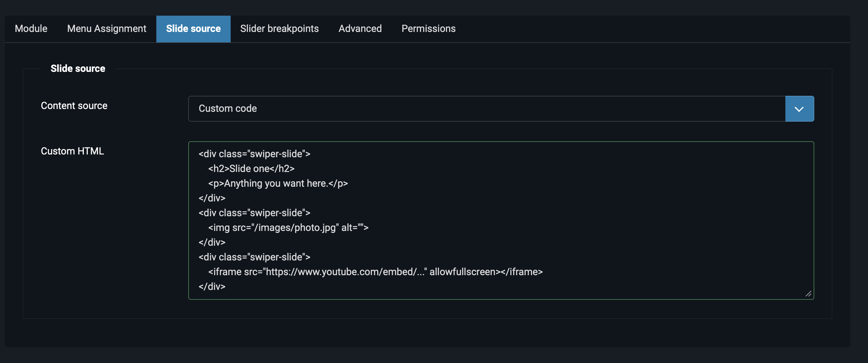
swiper-slide div.Inside the textarea, every slide must be wrapped in <div class="swiper-slide">...</div>. The module hands your markup directly to Swiper, which expects this exact class on each slide. Forget the wrapper and your slides won't render.
A minimal three-slide example
<div class="swiper-slide">
    <h2>Slide one</h2>
    <p>Anything you want here.</p>
</div>
<div class="swiper-slide">
    <img src="/images/photo.jpg" alt="">
</div>
<div class="swiper-slide">
    <iframe src="https://www.youtube.com/embed/..." allowfullscreen></iframe>
</div>
The result: three slides — text, image, embedded video — that all transition together inside one slider. Each swiper-slide is independent, so you can mix any content you like.
Embedding other Joomla modules
Custom code lets you nest other Joomla modules inside slides using the standard {loadmoduleid N} syntax (replace N with the module ID). The module's Load Module content plugin must be enabled, which it is by default.
<div class="swiper-slide">
    {loadmoduleid 42}
</div>
<div class="swiper-slide">
    {loadmoduleid 43}
</div>
This is how you build a slider whose slides each contain a different complex module — a custom HTML block, a contact form, a product grid from a commerce extension. The slider becomes a thin wrapper around modules that already exist on the site.
Image slider
The classic marketing-banner source. Each slide combines a background image, a heading, a body line and a call-to-action button. This is what most people picture when they hear "homepage slider".
How to configure it
Pick Image slider from the Content source dropdown. A subform titled Slides appears, with a + button to add slides one at a time.
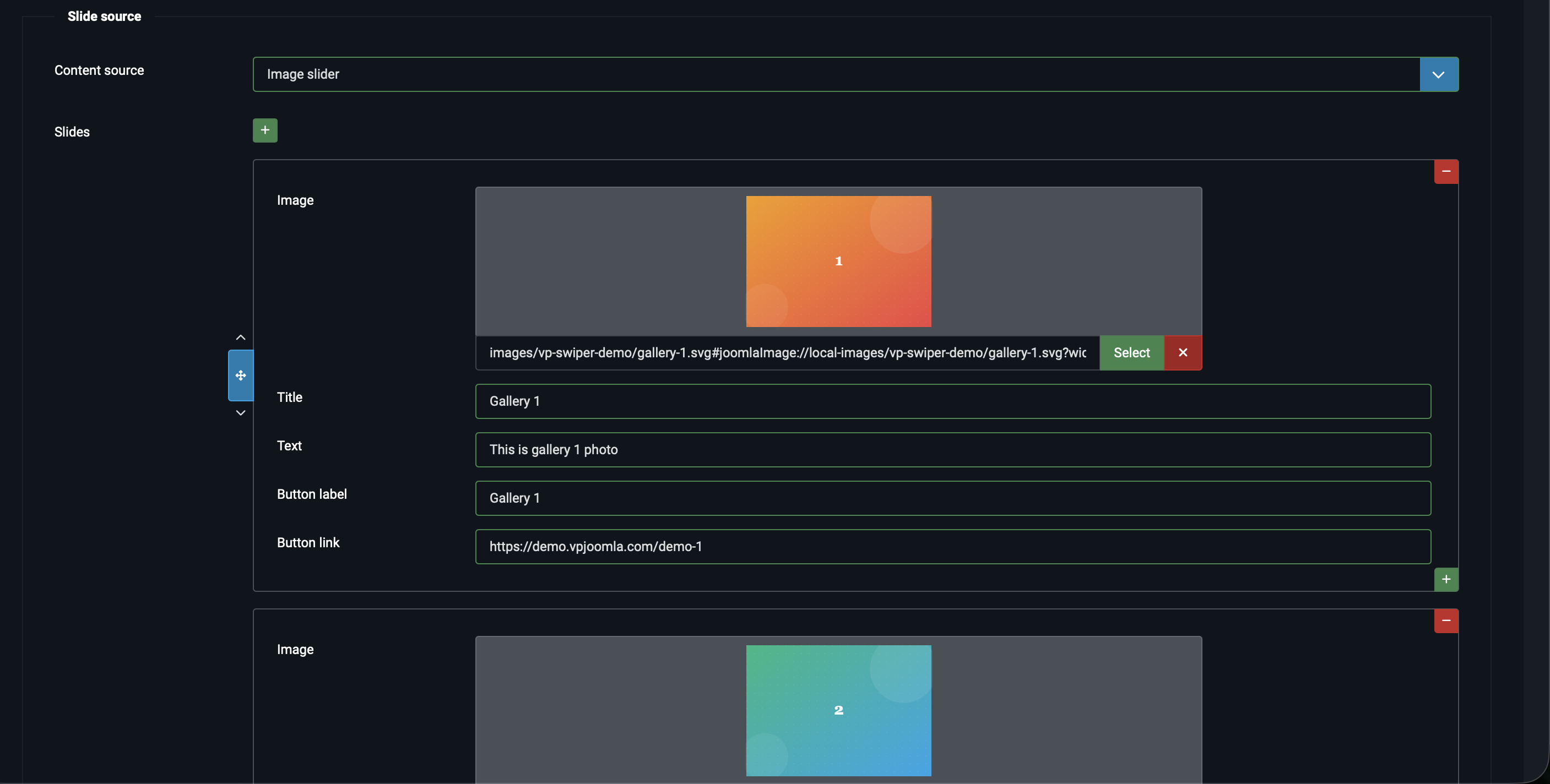
Each row in the subform has these fields:
- Image — the background image, picked through Joomla's media manager. Wide aspect ratios work best (1920×800 or similar) since the image fills the full slide.
- Title — the heading shown on top of the image. Optional, but usually present.
- Text — a short supporting line under the title. Optional.
- Button label — the text on the call-to-action button. Optional — if you leave it empty, no button appears.
- Button link — where the button leads. Required if you've filled the button label, ignored otherwise.
Reordering slides
Each slide row has a vertical drag handle on the left (the up/down arrows). Click and drag to reorder. The order in the subform matches the order on the frontend exactly.
What it looks like on the frontend

The image fills the slide background. The title sits over the image in a large font, with the text line below it. The button anchors to the corner. Hover over the slide and the cursor switches to a grab handle (if you've enabled Grab cursor on the Module tab).
Images
Looks similar to Image slider at first glance, but solves a different problem. Image slider is for hero banners — image as background, text and button overlaid. Images is for galleries — the image is the focus, optional caption sits underneath, and the whole slide can be a single link.
How to configure it
Pick Images from the Content source dropdown. A subform titled Images appears with a + button.
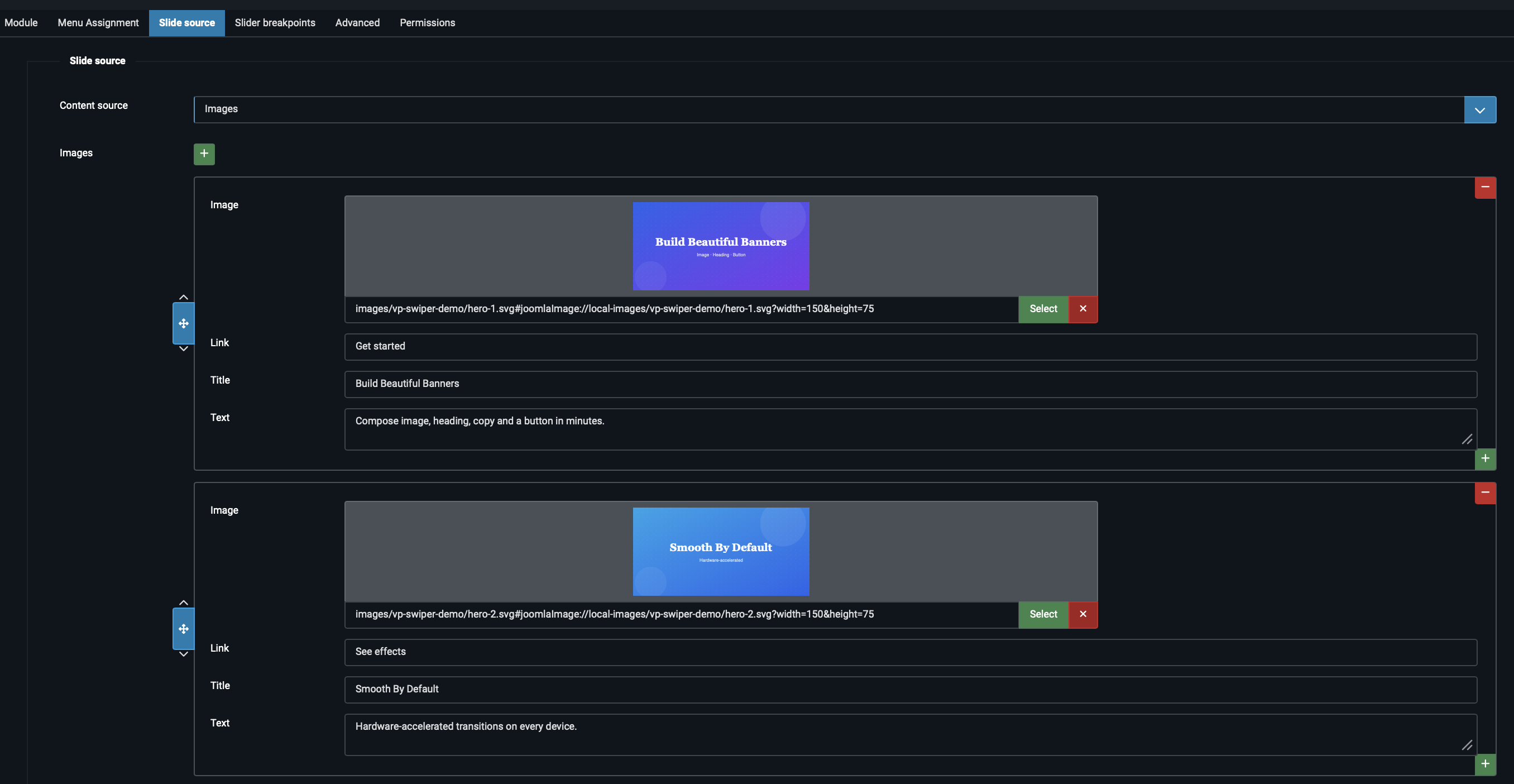
Each row has these fields:
- Image — the picture, picked through Joomla's media manager. Aspect ratio is up to you; square or 4:3 work well for gallery layouts.
- Link — optional URL. If filled, the entire slide (image plus caption) becomes a single clickable card. Leave empty for a non-interactive gallery.
- Title — optional caption heading, shown below the image.
- Text — optional supporting line, shown below the title.
Image slider vs Images — which to use
The difference between the two sources comes down to layout intent:
| Aspect | Image slider | Images |
|---|---|---|
| Image position | Background, fills the slide | Content, sits within the slide |
| Text position | Overlaid on the image | Below the image as caption |
| Call-to-action | Explicit button with label | Whole slide is one big link |
| Typical use case | Hero banners, marketing slides | Photo galleries, portfolio strips, product cards |
Pro features that pair well with Images
The Images source is the natural foundation for two Pro features:
- ZoomPRO — pinch or double-click to zoom into each image. Turns the slider into a touch-friendly photo viewer.
- Thumbnail navigationPRO — adds a small strip of thumbnails under the main slider for jumping between slides. Standard e-commerce product gallery pattern.
Both are detailed in Advanced Pro Features.
Picking between the three
To decide which Free source fits, ask yourself one question first: what's on each slide?
- One picture, maybe a caption, click anywhere → Images.
- Picture with a headline and a call-to-action button → Image slider.
- Anything else — video, columns, custom layout, embedded modules → Custom code.
If you change your mind later, switching sources is safe: the inactive source's data stays in the database, so you can switch back without losing your work.
Next steps
- Articles & Vendors — the two Pro-only sources, for when Free isn't enough.
- Transition Effects — pair each source with the right transition (Fade for hero banners, Slide for galleries, and so on).
- Responsive Breakpoints — adjust slides-per-view per screen size, common when using Images.